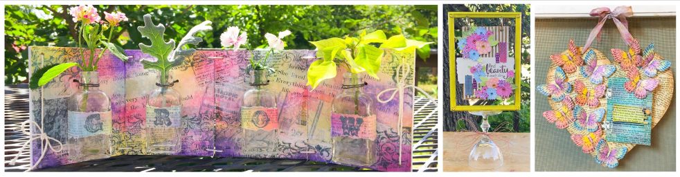
well, i’ve FINALLY finished editing all my photos and have them set up in not ONE but TWO albums! i had too many photos for just one! for the best viewing; click on the gallery link, then select “slideshow” and sit back and watch the show!
I’ve also included links for ALL of the companies – so if you want to view their full collections, just click on a company name!
here are the companies that are included in the galleries:
CHA GALLERY ONE
7 Gypsies
Basic Grey
Bo Bunny
Clearsnap
Cosmo Cricket
Crafty Secrets
Creative Impressions
Daisy D’s
Doodlebug
Fancy Pants
GCD
Graphic 45
Hambly
Heidi Grace
Heidi Swapp
Ideology – Tim Holtz
Imaginisce
Little Yellow Bicycle
Mollie & Mac – NEW!
Moxxie
My Mind’s Eye
Pebbles Inc.
Prima
Ranger
Reminisce
Rusty Pickle
Scenic Route
SEI
Tada – NEW!
Tattered Angels
The Paper Element – NEW!
Crate Paper
Dream Street
Glitz
Jenni Bowlin
KaiserCraft
Luxe
Maya Road
Piggy Tales
Pink Paislee
October Afternoon
Webster’s Pages
and now for my recap:
new companies i liked…
The Paper Element, they had a nice variety of new collections, and i really liked their Hot Chocolate line – it would be great for “coffee” projects or layouts. their new lines are not posted on the website yet, but some of the older ones are REALLY great so take a look!
Mollie and Mac, they only had ONE collection, but i REALLY liked it! it had a vintage feel in very mixable dark reds and blues.
TaDa, i liked the colors and designs of their collections, and i really liked their diecut papers – they had some really unique styles!
my show favorites…
Prima – they are NOT just a “flower” company any more! this booth had a FABULOUS WOW factor! they had it all – great papers, great embellies, trims, projects, and of course more flowers than you can shake a stick at! LOL! they also have a new hybrid line for those of you who digi! i found a LOT to look at and a LOT to love from Prima!
Graphic 45 – i just can’t say enough good things about this company! i LOVE, LOVE, LOVE their lines! being a vintage fanatic, this company is right up my alley! their booth was decked out to the 9’s with ABSOLUTELY STUNNING vignettes filled with AMAZING projects! their new lines BOTANICABELLA and PLAYTIME PAST are just GORGEOUS! i can’t wait to get my hands on some!
Maya Road – another exciting booth, i asked jessica to show me the new products and she walked me around the ENTIRE booth! there was TONS of new stuff! i really liked their MAYA MISTS, DIECUT SHEER SHEETS and new CLEAR RIBBONS too! The MAYA MISTS come in gorgeous MATTE colors and look amazing on chipboard. there are also some shimmery shades – silver, gold and copper that you can use alone or on top of the other colors. the DIECUT SHEER SHEETS are perfect to use as masks on chipboard or paper when using the MAYA MISTS, or you could cut them apart and use them on a layout! i don’t see all the new things on their website yet, but i’m sure they will be updating soon!
Scenic Route – always one of my favorites – i just LOVE their colors and styles! i particularly like the new SONOMA line. i liked the mix of somewhat contemporary large print papers with small print vintage style papers.
October Afternoon – i didn’t see the new lines on their website yet, but i’m sure they will be updating soon! having 2 BOYS, i’m always on the outlook for BOY lines! i found lines i liked at OA, and a lot of the colors in their collections work for BOY layouts too!
Glitz – i LOVE the pop-graphic vibe going on at glitz! all those fabulous bright colors bouncing off your basic black and white! LOVE IT!
Piggy Tales – i liked a lot of their new lines, especially ITSY BITSY SPIDER, LOVE the color combo of yellow, black, white and lime green! (didn’t see the new lines up yet!)
Jenni Bowlin – i thought her new CREPE PAPER RIBBONS were fun and unique!
Ranger – who can ever have enough STICKLES! i like the new ones that Ranger has introduced in the Distress colors!
Luxe – LOVE the new SIMPLY LUXE line, as the name inplies it is a simple line – but it is SIMPLY FABULOUS! great basic colors in FAB designs to mix and match!
Crate Paper – another one of my must have lines!
Pink Paislee – LOVE the PIXEE STICKS! new glitters!
Webster’s Pages – LOVE their new CALENDAR PAGES, they are gorgeous! they come in 12 X 12 and 6 X 6.
Reminisce – their new ENCHANTED AUTUMN line used HOLOGRAPHIC paper that is TOTALLY unique! i didn’t see anything even close to it at the show. you HAVE to see this line in person, photos don’t do it justice. you can see a little bit of the HOLO effect if you look at my CHA projects, the pics of the party set capture it best. i also love their new school line MAKING THE GRADE, this one has it ALL, papers, embellies, 3D stickers, alpha stickers, 12 X 12 stickers and MORE!
trends i spotted…
MORE BLING! bling is BIG! most of the lines now have some type of specialty papers, glittered, shimmery, embossed, etc. GCD introduced new double sided shimmer papers, Chatterbox had all kinds of BLINGY papers, Reminisce had the new HOLO paper in their Enchanted Autumn line and their FROSTED line is literally dripping with glittery effects!
back to basics – at least color-wise, i spotted several companies who introduced lines with “solid” colors, that isn’t to say they didn’t have patterns to them, just that they were mainly one color with either black and white elements or some type of BLINGY element! look for them with Chatterbox, Doodlebug, Pebbles Inc and Luxe.
i’ve also included a few photos from our outings in Chicago, you can see them HERE!
well, i guess that’s about it, i hope you have enjoyed my views from CHA!!!
—note: because i’ve seen it asked about and commented on in message boards…
i took a LOT of these photos before the show opened each day, so that is why there aren’t crowds or a lot of people in the background. i was also VERY patient; and for those photos taken when the show was open, i waited for “clear shots”!
thanks for the great response to this post!

You are amazing for sharing all this …thanks so much!!!
Thank you so much for all the pictures & links! Love looking at all the new stuff coming out!
Wow Tami! I feel like I was there too!! Thank you so much for spending the time to not only take the photos, but to edit and upload them for those of us who can’t go to these shows!!!
Wow, what a lot of work for you to put together. Just wanted you to know I appreciated your hard work. Thank you so much for sharing CHA with those of us who would love to attend!
:)
Tami:
THANK YOU! This is the best review and photo re-cap I have seen from Summer CHA. I almost felt like I was there. Your work is much appreciated by those of us who were not in attendance this year.
Thanks so much for sharing your pics….I needed a fix!
You are a kind, generous soul to go through all that time and work to share all this with us. Thank you most sincerely, I loved every photo and really loved the manufactures “sign” telling us whose booth we were about to see. Have a great rest of the week.
thank you very very much for such a detailed recap. A superb job.
Hi Tami
I’m not sure how I stumbled upon your blog but boy am I glad I did !
A layout of mine was displayed at the Glitz Booth becos I won a contest of theirs just before CHA – I today I finally caught sight of it on display at the Glitz booth – thanks to your pic 109 of 152 on your CHA Gallery 2 pics – of course I have gone ahead to download it – I hope you don’t mind ?
many many thanks for your wonderfully clear pics of CHA Summer 2008 ! & I love your trends recap !!! I hear you on a coupla of them ! lol
thanks so much ! Peark